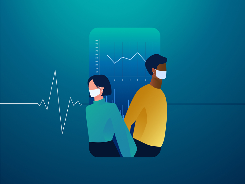
While practicality is important, empathetic design can go a long way when designing for health.
Talking about health is personal, and the same is true when we design for health. Not only do we need to create solutions that are engaging and intuitive, but we need to remind ourselves that what we create will affect someone’s wellbeing.
Maintaining a balance between the medical criteria and metrics whilst reminding ourselves that the numbers we see on screen represent a human life - is what makes designing for health both challenging and fulfilling.
Below are 4 key areas we focus on when designing for health:
Privacy
Most people don’t go around shouting out their medical history to strangers, in fact your medical and health records are confidential and can only be accessed by someone if you authorise them to do so. This means your app must establish trust and the one way to do this is through transparency.
Be candid about who has access to the users personal information. Is there a third party that will access this data? If so, what will this third party do with the data? Don’t shy away from using this opportunity to inform the user as this will establish trust.
Give users the option of restricting or revoking access to their data should they wish to at a later stage.
When requesting permission to access the users private information clearly indicate your intentions and how it will benefit the user should they grant it you. Avoid asking to access data when the user is not on the screen that will put this data to use. A request to access data may seem suspicious if there is no clear need for it.
When your request to access data is clearly related to the current context, you help users understand our app’s intentions. They’re sharing private information with you and you need to reassure them.
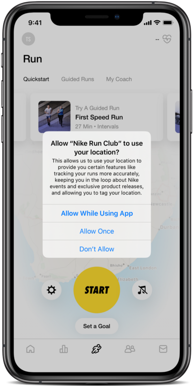
Nike Run Club
The Nike Run Club app asks for permission to access the user’s location only when they start their first run. This provides context for why the app needs access to their location data. This is accompanied by a detailed description of how this information is used when permission is granted, including instances that are not specific to running. Therefore, users can make an informed decision about sharing their data. Being transparent about how the data is used helps build a sense of trust between the user and the technology.
Data
Every person’s medical journey is unique and important to their health. Providing a dashboard that displays the collected health-related data in a way that visualises important trends and highlights abnormalities is invaluable.
A 2019 study on the efficacy of health timelines found that data visualisation improved the understanding of clinical data and helped participants recognise complex patterns faster. Another study, conducted by Stanford University School of Medicine and Apple into the detection of certain heart-related medical conditions, found that digital health alerts can enhance engagement with the health care system overall.
It is evident that medical data is important. To find the best way to display the data you first need to understand what you’re trying to solve. Do you need the user to track certain actions such as adding their blood glucose count daily? In cases like this, tasks enable the logging of patient symptoms and other important data and work well when consistent input is required from the user. When you need to display large amounts of complex data in a way that is easy to understand, then charts or graphs are best. Charts help to visualise data that can help a user understand how their treatment is progressing or how well they’re doing at maintaining their 21-day fitness challenge.
When using graphs, it’s important to:
Highlight trends to illustrate progress;
Clearly label each axis, title and subheading while avoiding lengthy descriptions and repetition;
Provide a legend when ambiguity causes confusion;
Group and organise data in a logical manner.
Keep data visualisation as simple as possible. How we display data should always be a tool that helps the user, not a showcase of technical prowess.
Language
While practicality is important, empathetic design can go a long way when designing for health. When we keep our tone and the language we use positive, uplifting, and motivational we help users feel more hopeful about the outcome of their treatment or motivated to continue with their fitness challenge.
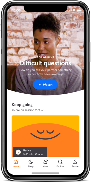
Headspace uses motivational language to encourage the user to begin their journey
Headspace is one example of thoughtful use of language in design. Focused on meditation and mental health, the app has a friendly and uplifting tone. Using phrases like “Here we go” instead of “Start your journey” makes the user feel like they are being supported from their very first interaction. Headspace understands their users and emphasises the importance of the way they communicate with them.
Accessibility
Health and wellness is a global societal concern. We all need to maintain and manage our physical and mental health. Therefore, it’s important to consider the needs of all those who use your app.
7,5% of South African people have a disability that affects their daily life. Designing your app with accessibility in mind, ensures that it is possible for every user to benefit from it.
The iOS Human Interface Guidelines and Material design have established guidelines when designing for their specific platform. When following these guidelines, we ensure we utilise the integrated accessibility settings provided by Apple and Google. The accessibility features provide users with the option to change contrast and font size based on their individual needs. It is further important to make use of design conventions that users are already familiar with to ensure ease of use.
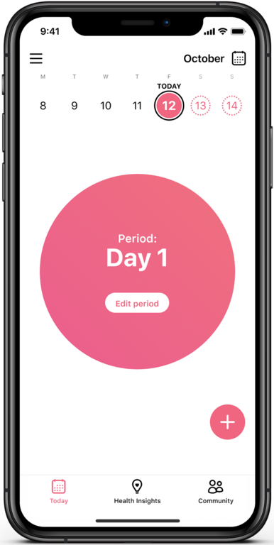
Flo health insights
Flo - a cycle tracking app for women with over 30 million active users have ensured that the font size throughout their app is dynamic. Resizing according to the specified accessibility settings of the user’s device. Not all health-related apps implement dynamic text sizing and marginalize a large portion of their users.
In this ever-changing landscape of medical technology, designing for health is a big responsibility. The challenge of design in the medical space is to create solutions that satisfy the requirements of stakeholders and positively affect the lives of users. We have to be innovative, precise and empathetic to create products that are purposeful and add real value.
References
[1] Ledesma, A., Bidargaddi, N., Strobel, J. et al. Health timeline: an insight-based study of a timeline visualization of clinical data. BMC Med Inform Decis Mak19, 170 (2019). https://doi.org/10.1186/s12911-019-0885-x